
Rates scale better than counts
Service monitoring, part art, part science. What I attempt to do in this series of posts on metrics is to lay down some basic principles that I have found to be helpful without being too prescriptive.

One observability approach I have seen often gotten wrong is attempting to use counts to understand how the service is operating. There are a number of issues with this approach, so let’s start with dashboards and monitors and then work our way back to the code.
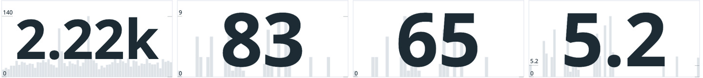
Counts require too much context: As a service owner, if I look at my dashboard every single day, I might have a gut feeling on whether “83” or “2.22k” is a good or not good number for a specific metric for my service, but usually I don’t. Because in addition to count, I also need to ensure I am looking at the correct timeframe. Is “83” a good number when I’m looking at a days worth of data? 5 minutes? 2 weeks? What should that look like over 90 days? Even if I know the answer to that question, it is highly unlikely everybody else on my team does. And what about anyone else who comes to look at my dashboard? Are they going to understand what these counts mean and whether they are good or bad? Or am I going to have to always be present to interpret the data for them? That doesn’t scale.
Counts don’t scale: As a business changes over time, and hopefully grows exponentially, counts will inevitably change. A count that looked good yesterday at 100tps, might not look good tomorrow at 200tps or in the middle of the night at 50 tps and and certainly will be quite different when traffic reaches 12,000tps.
Monitoring with “magic numbers”: Another problem with counts is when we need to build some sort of logic to do something when a count reaches a certain threshold. This can include monitors and can also include automations like blocklists. If I build a monitor that pages when the number of errors reaches “10” every 5 minutes, how do I know that’s the right threshold? When does it need to change? Is 10 errors every 5 minutes OK during peak traffic in the middle of the day? Is the same number OK when traffic drops significantly in the middle of the night.
Normalization of deviance: Using “magic numbers” for monitors is almost always the wrong approach because as humans we tend to base these numbers on how much pain we are willing to endure. If I set my monitor to page me in the middle of the night, you better believe I’m going to make sure that magic number is set high enough that I won’t get woken up very often. It’s very normal practice to tune monitor thresholds to try to keep monitors from being too noisy and also not noisy enough, so that part is normal. However, being as counts don’t scale, what ends up happening in practice is there is a lot more noise than signal to work with. Therefore, we normalize the deviance by setting the thresholds higher than they need to be to account for noise, and as traffic increases were are constantly fighting with thresholds rather than searching for signal and understanding if the problem we are dealing with is getting better or worse.
Rates Scale Better: Rates are a pretty simple concept. Let me start with a simple example.
Rate = Signal Count / Total Transactions * 100
Using this approach scales to any scale of transactions and any timeframe. If you’ve established what the normal error rate is, such as x%, you can now do a number of different things that you cannot do with counts.
Signal becomes constant over timescale: Viewing the dashboard for any timescale requires no interpretation. You can view rate over 5 minutes, 60 minutes, 2 weeks, or 90 days, and it becomes much more constant.
Signal over noise is much easier to visualize: If you look at a graph and the error rate spikes, you know that you have deviance over the norm without interpretation. If you are displaying counts, you may see spikes, but without context, you might not know of those spikes are caused by traffic spikes or actual deviation from the normal error rate.
Much easier to tune thresholds: Rates smooth out traffic spikes. So traffic based on time of day or day of year doesn’t matter so much. Your are monitoring the rate at which something happens. You still need to tune the monitor to make sure action happens at the proper threshold, but over time, it tends to be a much more stable number.
Deviance becomes less normal: If you have constant error rate that is expected and that changes with a given deployment, you know it. If error rate goes up, you know you might have a problem. It might be good, it might not be good, but at least you can see easily, react to it, determine what’s happening, and respond accordingly. It’s hard to see that with “magic number” counts that usually are set too high to see deviance.
Easier to convey context: Once you understand your rates much better, understand what “normal” looks like, and have set your monitor thresholds accordingly, you can now do something to even better convey context to those outside of your service who come and take a look at your dashboard. You can add indicators to your graphs to include thresholds for Sev1/Sev2 notifications and in some cases it is best practice to include green/orange/red bands or lines to indicate expected performance or desired targets. This allows for easy interpretation of how your service is operating for anyone coming to see how your service is operating and makes for much easier monitoring for oncall operations.
Overall “Goodness” Rate: The above formula makes sense for determining rate of occurrence of some signal in your system, such as a known error, authorization failure, etc. However, there is another approach that works even better for high-level “goodness” measurement. There are two primary “goodness” indicators every service owner should know, availability and success rate. These are binary. The service is either available or it is not. The transaction was either successful or it was not. For determining “goodness” of availability, my preferred approach (when I have control over the metrics being emitted) is to compute availability by emitting a metric from the service client called “Available” with only two possible states:
Available=1 // Request was successfully processed
Available=0 // Request failed
Turning these into a rate is much simpler using a formula like this:
Availability = AVG(Available)*100
Requests that I choose not to count towards availability do not emit a metric, so there is need to have context and understanding of all the possible states. There are only two states. It’s binary. Simple to dashboard, simple to monitor